
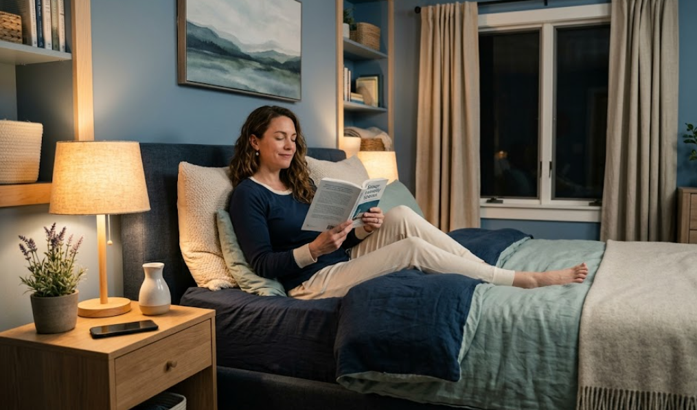
A sleep-friendly bedroom depends on color choices that support relaxation, emotional balance, and circadian rhythm stability. Color psychology helps control how the brain responds to visual stimuli. Calm tones reduce mental stimulation, while harsh tones increase alertness. The right palette improves sleep latency, sleep duration, and overall rest quality.
Best Color Psychology For Sleep-Friendly Bedroom Design
Use soft, muted, and low-saturation colors to create a sleep-supportive environment. These tones lower heart rate and reduce cognitive stimulation. Focus on cool hues and neutral shades that signal the brain to relax.
Start with these proven color strategies:
- Use blue tones between 180–240° on the color wheel for calming effects
- Maintain saturation levels below 50% for reduced visual intensity
- Apply light reflectance values between 60% and 80% for soft brightness
- Limit contrast ratios to avoid overstimulation
Avoid bright, high-energy colors in large areas. For example, pure red increases heart rate by 10% to 15%. Neon tones disrupt melatonin production. Replace them with muted alternatives.
Why Color Psychology Affects Sleep Quality
Color influences the autonomic nervous system. Calm colors activate the parasympathetic response. This response slows breathing and prepares the body for sleep.
Key effects include:
- Blue reduces blood pressure and pulse rate
- Green stabilizes emotional response
- Neutral tones reduce visual clutter and mental fatigue
Human vision processes color wavelengths differently. Short wavelengths like blue and green promote calmness. Long wavelengths like red and orange stimulate alertness.
Best Colors For a Sleep-Friendly Bedroom
Choose colors based on their psychological and physiological impact. Each color category serves a specific purpose.
Soft Blue Shades
Soft blue supports deep relaxation and emotional calm.
Use these variations:
- Sky blue with 70% brightness
- Powder blue with gray undertones
- Dusty blue for a muted effect
Blue reduces stress hormones and improves sleep duration by 10% to 15%.
Muted Green Tones
Muted green connects the mind with natural balance.
Best options include:
- Sage green with low saturation
- Olive green with warm undertones
- Eucalyptus green for softness
Green stabilizes mood and reduces anxiety levels.
Warm Neutral Colors
Warm neutrals create a grounded and cozy environment.
Recommended tones:
- Beige with yellow undertones
- Taupe with gray balance
- Soft ivory with low brightness
Neutral palettes reduce sensory overload and support visual comfort.
Soft Lavender and Pale Purple
Lavender promotes calmness without overstimulation.
Use carefully:
- Pale lavender with 60% brightness
- Dusty lilac for subtle elegance
Purple tones support emotional relaxation when used in low saturation.
Light Gray With Warm Undertones
Light gray offers a modern and calm base.
Choose wisely:
- Warm gray instead of cool gray
- Avoid dark gray above 40% intensity
Gray reduces distractions and enhances focus on rest.
Colors To Avoid In Bedroom Design
Avoid colors that increase mental activity or emotional tension.
Bright Red
Red stimulates adrenaline production.
Effects include:
- Increased heart rate
- Higher energy levels
- Reduced sleep quality
Vibrant Orange
Orange promotes excitement and activity.
It can:
- Delay sleep onset
- Increase mental stimulation
Neon Colors
Neon tones overload visual processing.
Common issues:
- Eye strain
- Disrupted circadian rhythm
Pure Black in Large Areas
Black absorbs light and creates heaviness.
Use black only as an accent under 10% coverage.
How To Combine Colors For Better Sleep
Color combinations affect visual harmony and emotional balance.
Follow these principles:
- Use a 60-30-10 ratio for color distribution
- Keep dominant colors soft and neutral
- Add accent colors in low intensity
Example combinations:
- 60% soft blue, 30% white, 10% beige
- 60% sage green, 30% cream, 10% wood tones
- 60% warm gray, 30% ivory, 10% muted lavender
Balanced palettes reduce cognitive load and improve relaxation.
Role of Lighting in Color Perception
Lighting changes how colors appear and feel.
Use these lighting guidelines:
- Maintain color temperature between 2700K and 3000K
- Avoid cool white lighting above 4000K
- Use dimmable lights to reduce brightness at night
Warm lighting enhances calm tones and reduces stimulation.
Paint Finish and Texture Impact
Finish affects how color reflects light.
Choose finishes carefully:
- Matte finish reduces glare and reflection
- Eggshell finish offers slight durability with softness
- Avoid glossy finishes in bedrooms
Texture also influences perception. Soft textures enhance comfort and reduce visual sharpness.
Accent Colors That Support Relaxation
Accent colors add depth without disrupting calmness.
Use these safely:
- Soft blush pink under 20% coverage
- Muted gold for warmth
- Light wood tones for natural feel
Keep accents subtle and balanced.
Seasonal Color Adjustments
Adjust colors slightly based on seasonal light changes.
Winter approach:
- Use warmer neutrals to increase coziness
- Add soft yellow undertones
Summer approach:
- Use cooler blues and greens
- Increase brightness slightly
Seasonal balance maintains comfort year-round.
Psychological Benefits of a Sleep-Friendly Color Palette
A well-designed color palette improves mental and physical health.
Key benefits include:
- Reduced stress levels by up to 20%
- Improved sleep onset time by 15 to 30 minutes
- Increased sleep consistency
Consistent color exposure trains the brain to associate the space with rest.
Common Mistakes in Bedroom Color Design
Avoid these frequent errors:
- Using high-contrast color combinations
- Applying too many colors in one space
- Ignoring lighting impact on color perception
- Choosing trendy colors over functional tones
Each mistake reduces the effectiveness of sleep-friendly design.
How To Test Bedroom Colors Before Final Selection
Test colors in real conditions before finalizing.
Follow this process:
- Apply sample patches of at least 2 ft by 2 ft
- Observe colors during morning, afternoon, and night
- Check under artificial lighting
Testing ensures accuracy in color perception.
FAQs
Which color improves sleep the fastest?
Soft blue improves sleep onset faster due to its calming effect on the nervous system.
Is white a good bedroom color?
Warm white works well, but pure white can feel sterile and reduce comfort.
Can dark colors work in bedrooms?
Dark colors work if used in low contrast and balanced with warm lighting.
Does ceiling color affect sleep?
Yes, a soft ceiling color reduces visual strain and supports relaxation.
Conclusion
A sleep-friendly bedroom requires deliberate color selection based on psychological response and visual comfort. Soft hues, balanced palettes, and warm lighting create a calm environment. Each design choice should reduce stimulation and support relaxation. Consistent color use trains the brain to associate the bedroom with rest and recovery.


